Mindbody

Mindbody is an online platform used by health and wellness businesses. It is used for client bookings, reports, class schedules, point-of-sale and business promotion.
The Problem
Mindbody is used by Yoga and Dance studios. Mindbody customers are frustrated that it is not user friendly, and is often confusing to use. It has an overwhelming amount of functionality, but still lacks features that are essential to supporting a business’ needs. It‘s time-consuming to learn and use and even experienced users report that is far too easy to make mistakes.
Why is this happening?
Customer needs not taken into consideration in the design
Content not organized in an intuitive way
Simple everyday tasks are overly complicated
What can I do?
Have an easy point-of-sale system
Simplify everyday tasks
Redesign the information architecture
The Solution
Make the everyday tasks of Mindbody quicker and more intuitive. Redesign Mindbody by reorganizing, decluttering, and simplifying its Information Architecture. This includes eliminating unused features to both reduce cognitive overload and potentially introduce lower cost offerings to encourage more small businesses to join Mindbody.
Design Process

Discovery & Research
SWOT
To dive in deeper to understanding where Mindbody could improve, a SWOT analysis is a simple step to get things started.

Value Proposition Canvas
Some key points for the future application were identified through the Value Proposition Canvas Exercise
Screenshots of Existing User Interface

Heuristic Evaluation of Existing System
In-depth Interviews
Interviews were conducted with 6 respondents to test the hypothesis based on research done to learn more about the user experience of those who use Mindbody regularly.
Hypothesis
The Mindbody interface is cluttered and includes too many unused features that makes on boarding more of a lengthy and costly experience.
It’s like a finicky old car. You need to learn all its quarks in order to make it work.
“
Tiffany, Studio Owner
“
We are just too far in. We are stuck.
Moe, Studio Owner
You wouldn’t get a non dancer or a non actor to design a theatre.
“
Tammy, Administrator
Insights
Strategy Statement
Redesign the layout of Mindbody to better satisfy the needs of the customer and accommodate the busy schedule of a small business. Simplifying or eliminating unused features and better grouping items will help the customer quickly navigate to the required functions with confidence. The overwhelming amount of options and unclear icons and wording often lead to negative feelings about the excessive time spent navigating through Mindbody. Simplifying the everyday tasks and eliminating clutter will lead to more clientele.
Persona
Information Architecture
The logical first step for the Mindbody redesign was dissecting the existing information architecture. This was done by creating a site map for the existing system. It becomes immediately evident that there is overwhelming and potentially unnecessary complexity.

Existing Mindbody System Site Map
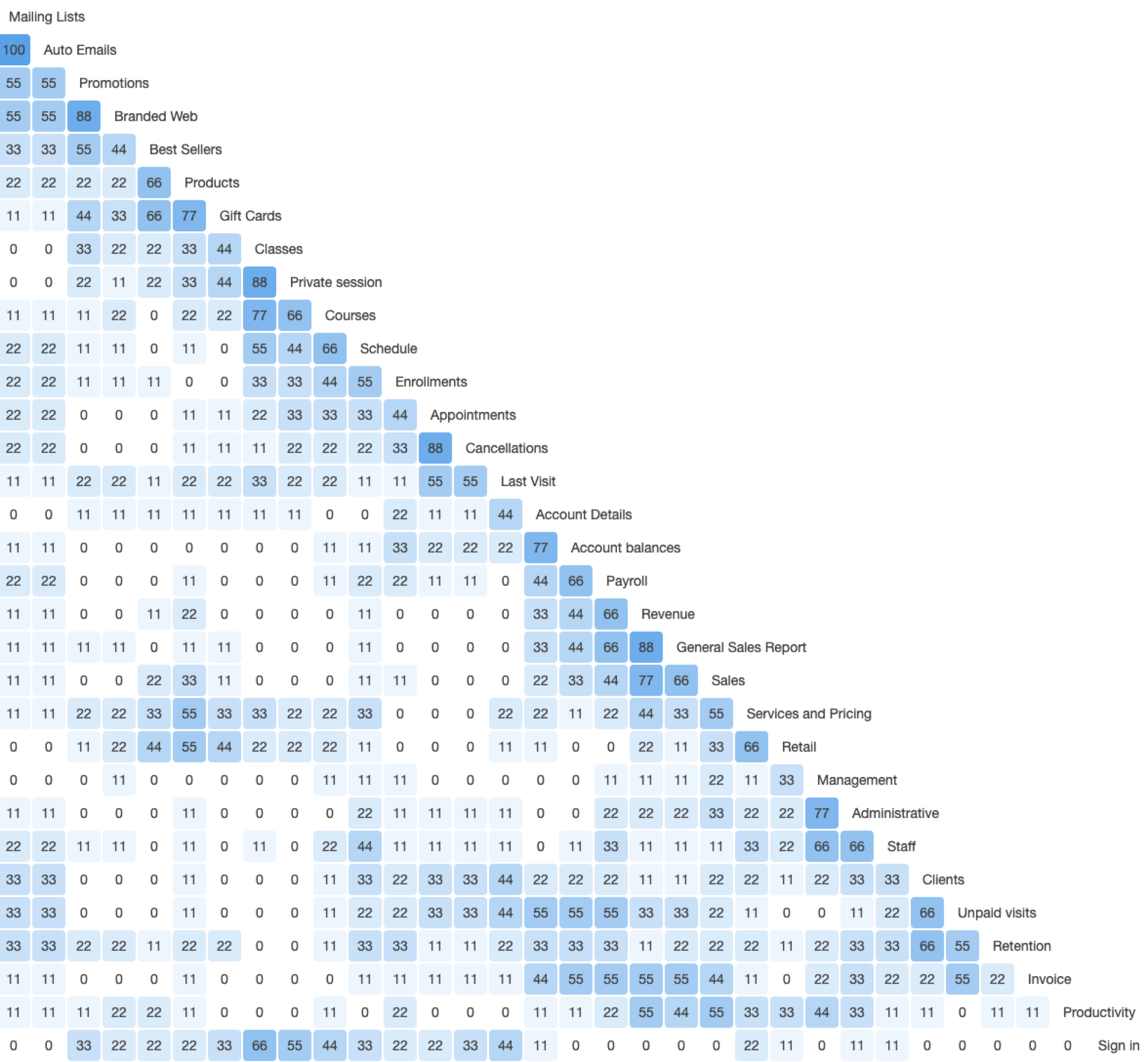
Card Sorting
Through the redesign process I leaned on card sorting to determine how average users would optimally organize information structures. Building off of interviews I took an informed approach by initially removing several pain points that were highlighted. For this process I used Optimal Workshop as a tool for testing and analysis.
Categories Created
Account/Accounting/Accounts/Revenue Accounting
Admin/Administration/Administrative
Business
Classes
Client Info/Clients/Customers
Departments
HR
Marketing/Market Research/Marketing & Sales/Targeted Marketing
Products/Products and Services/Public-Facing
Reports
Sales/Sales & Promotion
Scheduling
Staff

Significant groupings
• Mailing lists and Auto Emails (100%)
• Branded Web and Promotions (88%)
• Private classes and Classes (88%)
• Cancellation and Appointments (88%)
• General Sales Report and Revenue

Preliminary Site Map Redesign
The card sorting exercise allowed me to narrow the categories of the original architecture significantly. However, I thought it was prudent to test these new categorizations to ensure that my simplification and streamlining was successful.
Card Sorting Round 2

Admin
Business
Client Info/Client Personal Info/Clients/Connecting with Clients/Information for Clients/Profile
Customer Service
Employee Access/Staff
Inventory Management
Marketing
Operations
Retail/Things for Sale
Schedule/Scheduling
Services/Services & Products
Categories Created
Second Site Map Redesign
Tree Test

Tree testing was done to ensure users were able to complete tasks successfully. The degree of complexity of tasks was varied.
Results of Information Architecture Research
The current Mindbody system requires the customer to jump back and forth to complete a simple task. The introduction of the consistent Point of Sale system will make the completion of tasks quicker and easier to execute without mistakes. The multiple card sorting tests along with the tree testing helped to organize the necessary information in an intuitive way. The tree test confirmed that it is easiest for the user if all the information can be accessed from simple drop down menus without needing secondary menus.

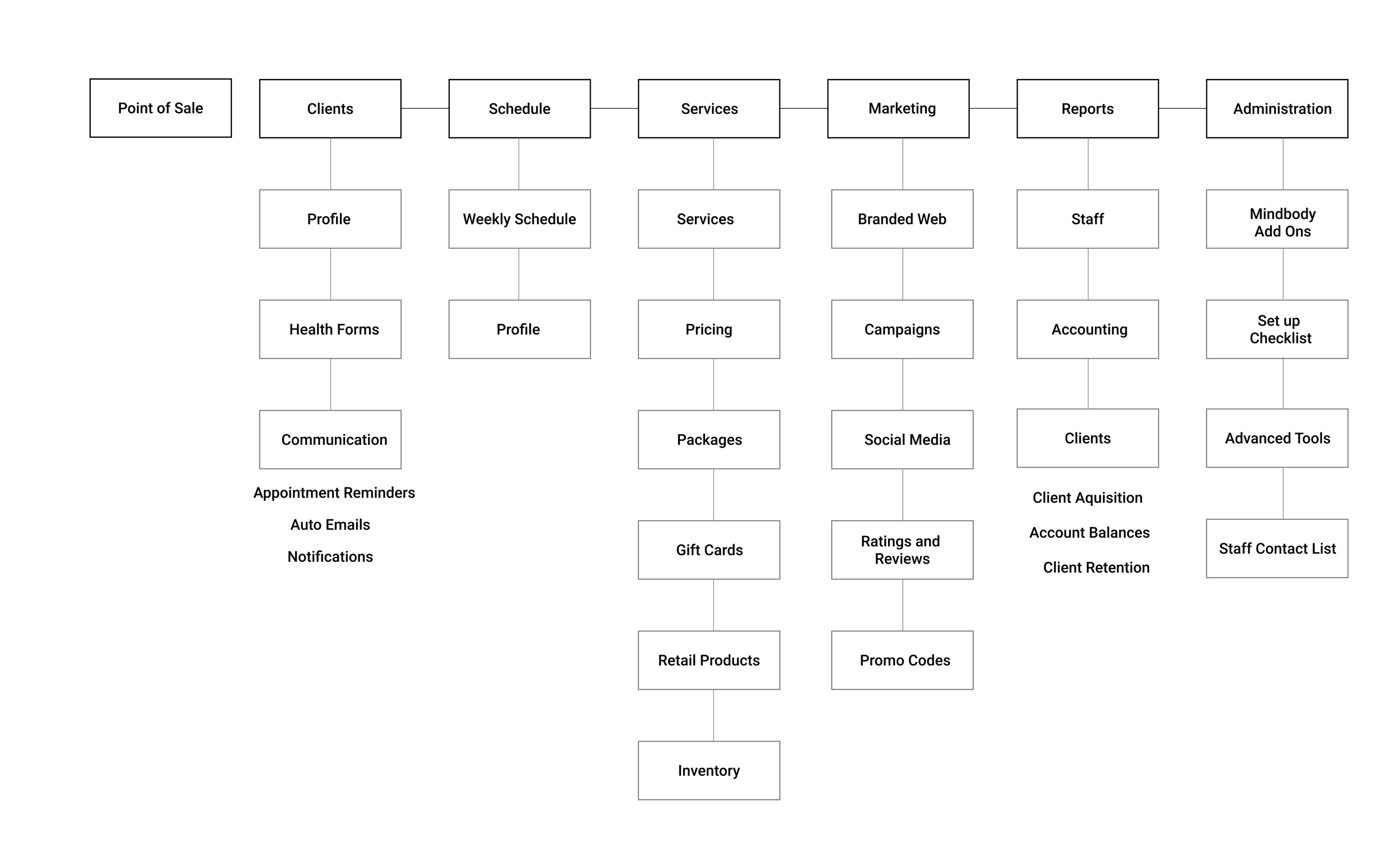
Final Site Map Redesign
Benefits
• Simple layout
• Intuitive grouping
• Less cluttered
• Point-of-sale accessible at any time
• Better suited to business needs
• Unused features eliminated
Ideation & Testing
What task urgently needs a redesign?
All of the tasks require more time and effort than a small businessperson can afford. The task that is most frequently undertaken over the course of a typical day is checking out a client. The majority of clients pre-register for a class online. Upon arriving at the studio, these clients need to be checked out, confirming payment and attendance.
Often clients purchase a package of classes online. A common task for studio staff is checking the class list or appointment schedule and confirming that these pre-purchased classes are being used when checking clients in. Additionally, clients may need to be reminded that they need to purchase another package.
Checking out clients occurs multiple times per day. It is inordinately time-consuming as completing this simple task requires jumping to multiple locations within the system.
Task Flow
01

Checkout Client With Package on File
02
Checkout Client Without Package on File

Wire Flow

Features
Profile

Dashboard

Usability Testing - Useberry
Task One- Checkout a client with a package on file

Step 1 - Select Class
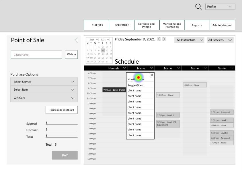
Step 2 - Select Client

Step 3 - Select Package

Step 4 - Checkout
Task Two- Checkout a client without a package on file

Step 1 - Select Class, Step 2 - Select Client

Step 3 - New Purchase

Step 4 - Select Item
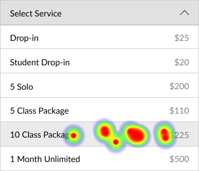
Step 5 - Select Package

Step 6 - Pay
In order to address misclicks demonstrated through usability testing, in the next phase of prototyping a focus was to ensuring the user is confident moving from selection of a class to payment.

Step 7 - Choose Payment Type

Step 8 - Confirm

Step 9 - Checkout
In-Person Usability Testing
The low fidelity wireframe prototypes were tested with 4 people who gave live feedback while performing task.

“
I could tell it was trying to capture my attention and tell me where to go
I like that when checking out the packages available were displayed. If the client needs to purchase another package you can tell right away. I didn't have to search for things. It's all here. It's intuitive.


